Web Design
Web Development
NutriHub
📌 Overview
Project Name: NutriHub
Role: UI/UX Designer, Web Developer
Goal: Promote healthy living, encourage newsletter sign-ups, and offer personalized tools like a calorie calculator.
Target Audience: Individuals seeking wellness, meal planning support, and nutrition advice.
🎨 Tools & Methods Used
Figma – for wireframing, visual design, and component libraries
FigJam – to map user journeys and define the core funnel
Google Fonts + Custom Icon Set – for accessible typography and clean visual identity
WebAIM Contrast Checker – to ensure legibility and accessibility
Attention Insight – for AI-powered heatmap analysis and visual attention validation pre-launch
🔁 UX Design Process
Empathize:
Conducted informal user interviews and research on barriers to healthier eating. Insights showed users often feel overwhelmed by too much information or unclear next steps.
Define:
Synthesized findings into a clear user need: “I want to eat healthier, but I need a clear and realistic starting point.”
Ideate:
Explored ways to break the experience into small, motivating steps. Key features like the calorie calculator and structured 3-step flow emerged from this phase.
Prototype:
Built mid- to high-fidelity wireframes in Figma. Emphasis was placed on visual hierarchy, CTA placement, and storytelling through imagery.
Validate:
Ran Attention Insight heatmaps to test focal points and ensure key CTAs and headlines were receiving attention. Adjustments were made to improve visual flow based on this feedback.
👣 User Journey Overview
The NutriPath homepage is structured to guide users seamlessly from discovery to subscription:
1. Arrival – Grab Attention
User Goal: Understand what the site offers
Design Solution: A strong headline and dual CTAs give immediate clarity and choice. Attention Insight confirmed high visual focus on the hero area.
2. Orientation – Understand the Path
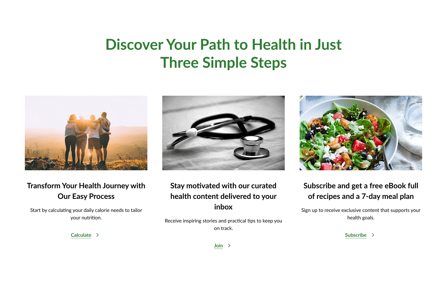
User Goal: See how it works
Design Solution: A simple 3-step visual flow (Calculate > Join > Subscribe) breaks the process into clear, actionable stages.
3. Engagement – Get Personalized Value
User Goal: Find personal relevance
Design Solution: The calorie calculator provides instant, tailored feedback — increasing time-on-site and trust.
4. Trust – Validate the Brand
User Goal: Know it’s credible
Design Solution: Testimonials and trusted partner logos build confidence right before key CTAs.
5. Conversion – Take Action
User Goal: Decide whether to subscribe
Design Solution: A strong incentive (free meal guide) and clean form design reduce friction and support conversion.
🌟 Section Breakdown
🎯 Clear Messaging & Purpose
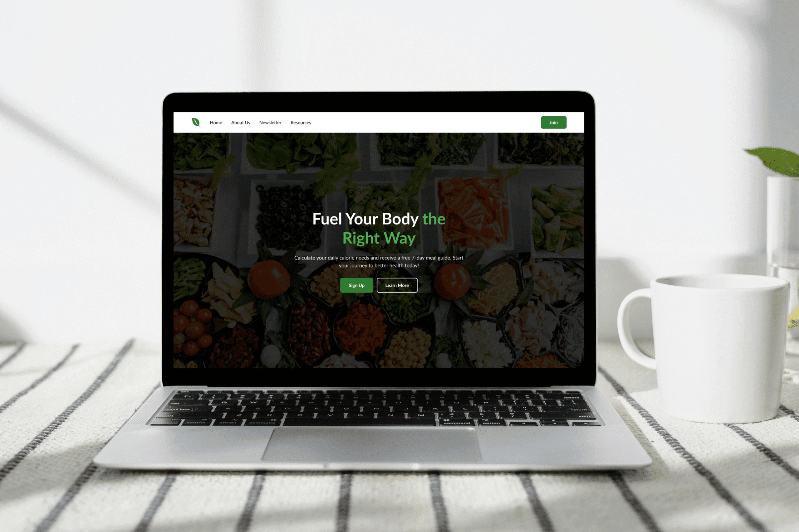
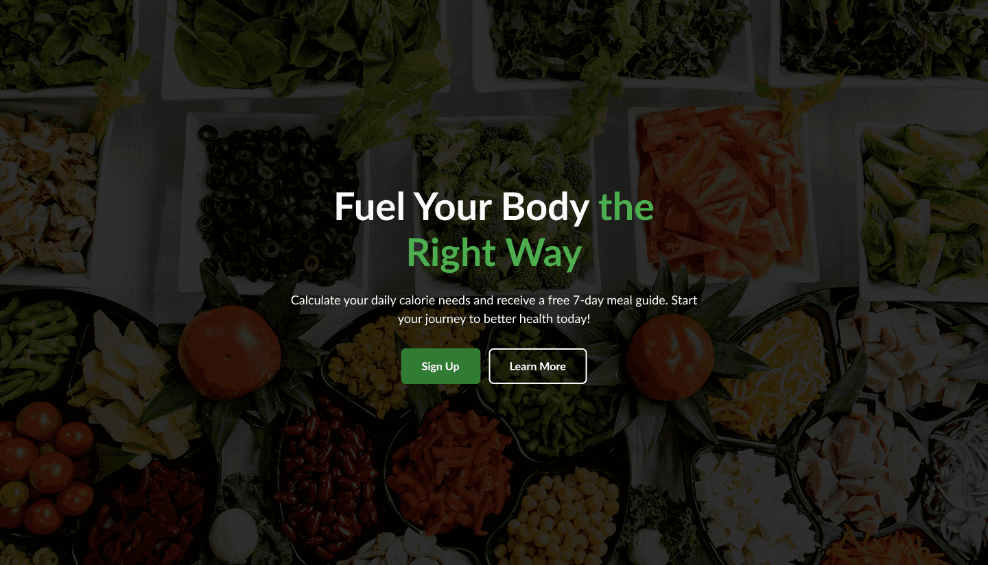
The homepage instantly communicates its value proposition: "Fuel Your Body the Right Way." This message is direct, motivational, and aligns with the site's purpose of promoting better health. The subtext reinforces the offering (calorie calculator and free meal guide), which is highly relevant to the target audience.
📸 Visually Appealing Imagery
High-quality, vibrant images of fresh food create a strong visual appeal. These not only inspire healthy eating but also build trust by showcasing real, appetizing meals.
Simple & Effective Onboarding Flow
The “Three Simple Steps” section provides a clear path to engagement:
Calculate your needs
Receive curated content
Subscribe for extras
This makes the user journey easy to understand and follow. The layout is straightforward and mobile-friendly.
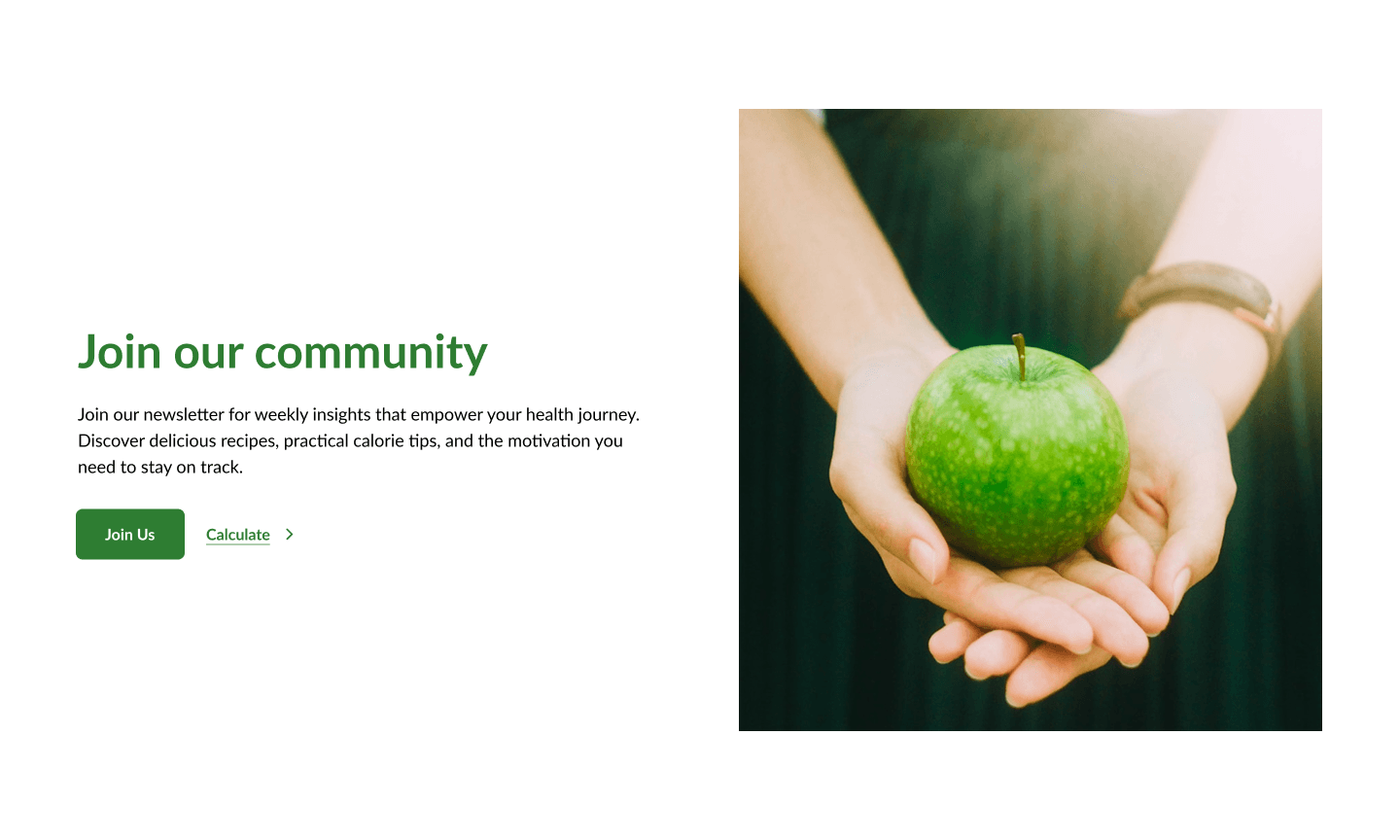
👥 Strong Community Invitation
The use of a heartfelt visual (hands holding an apple) reinforces emotional appeal. The copy encourages users to be part of a supportive health-driven community — a great way to foster trust and long-term engagement.
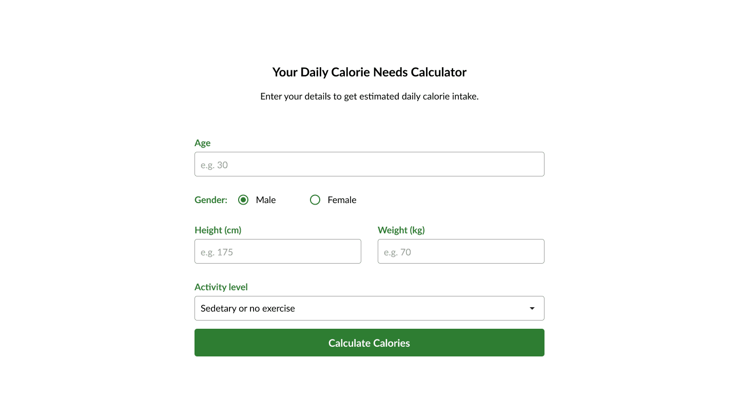
📈 Built-In Value: Calorie Calculator
Offering a calorie needs calculator directly on the homepage provides immediate, practical value. It encourages user interaction and supports the site’s goal of helping users take action on their health.
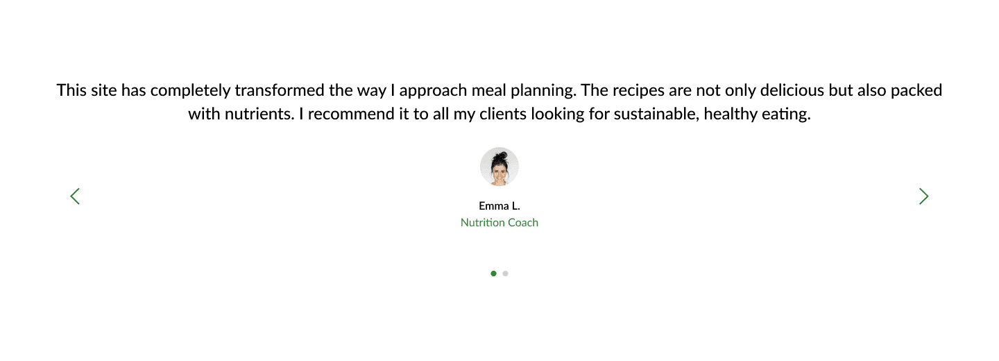
💬 Social Proof Through Testimonials
Featuring a real testimonial from a nutrition coach adds credibility and authenticity. The quote is concise and focused on benefits, making it highly effective.
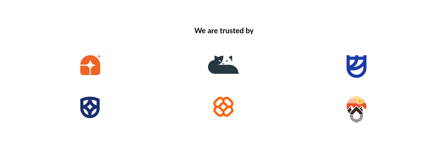
🏆 Trust & Credibility Signals
Including recognizable logos and badges builds trust with new visitors. The section is clean and subtle, maintaining the overall aesthetic while reinforcing credibility.
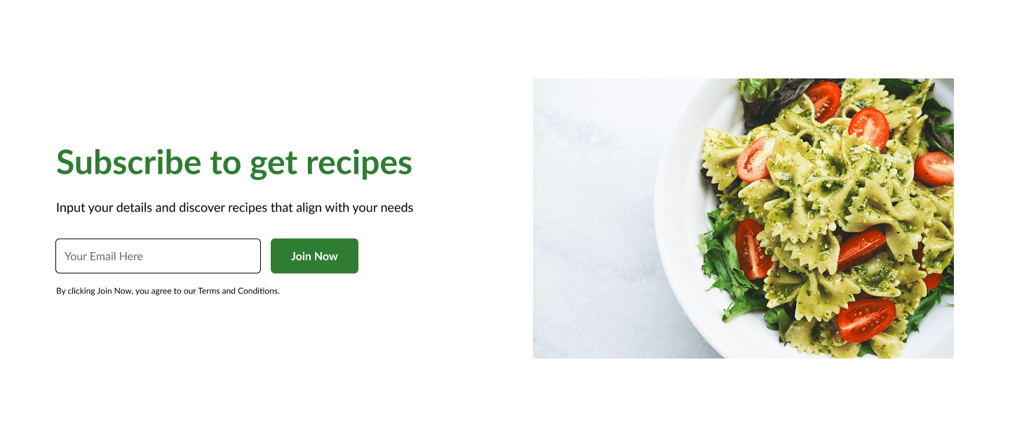
📬 Effective Email Capture Strategy
The call to action to “Subscribe to get recipes” is benefit-driven and supported by a strong visual (a colorful, healthy pasta dish). It's an excellent incentive for users to join the mailing list.
⚠️ Noteworthy Area for Improvement
Readability on Hero Background
The hero image is visually engaging, but some of the white text overlaps brightly colored vegetables, making it slightly hard to read on smaller screens. This is a minor but important area to enhance accessibility and user experience — a subtle dark overlay or bolder text could solve this.
✅ Final Thoughts
The NutriHub homepage is a well-crafted, user-centric design that successfully blends visual appeal with functional value. It clearly guides users through an engaging journey — from discovering the site’s purpose, exploring resources, and using tools, to subscribing for ongoing value.
With thoughtful design choices and strong messaging, the homepage creates an inviting experience that supports both user needs and business goals.